The connection between color and food psychology plays a powerful role in how we perceive flavor, health, and even satiety. For instance, a study published in the magazine Flavour highlighted that color is perhaps the most critical intrinsic sensory cue influencing how we anticipate the taste and flavor of food and beverages (Spence et al., 2015).
At Paradise Fruits Solutions and Paradise Fruits Health, we understand that while flavor and function lead the way, the color of food still plays an essential supporting role in the overall eating experience. In this article, we’ll explore how color shapes our relationship with food, what science says about it, and how we approach it across our own product development.
Table of contents
The Psychology Behind Color & Food
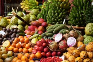
The study of color and food psychology explores how visual cues influence taste perception, emotional response, and buying decisions. Our brains are wired to associate specific colors with freshness, ripeness, and flavor intensity – long before we take the first bite.
A study published in the journal Appetite found that people rated identical drinks as tasting sweeter or more refreshing depending on the color of the glass they were served in. In another experiment, researchers showed that people preferred red-colored drinks when expecting fruity or sweet flavors – even when the taste remained the same.
Color is processed faster by the brain than taste or smell, meaning that color of food is often our first impression and one that sets expectations for what follows (Cavicchioli et al., 2020, Frontiers in Psychology).

What Colors Do to Our Perception
Color doesn’t just influence appetite; it also evokes emotions and meanings. Here are some of the most common color associations in food psychology:
-
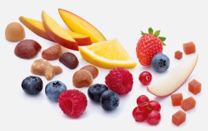
Red
- Stimulates appetite and excitement
- Often linked with sweetness and indulgence
- Common in berries, sauces, and snacks
- Frequently used in food packaging to grab attention
-
Yellow/Orange
- Seen as cheerful, fun, and energetic
- Associated with citrus, sunshine, and freshness
- Works well in candies, drinks, and breakfast products
-
Green
- Symbol of nature, health, and freshness
- Perceived as clean, nutritious, and plant-based
- Popular in smoothies, supplements, and functional foods
-
Blue
- Rare in natural foods, sometimes seen as unappetizing
- May suppress appetite
- Associated with calmness or coldness
- Used sparingly in niche product categories
-
Purple
- Conveys luxury, depth, and uniqueness
- Often used in berry-based products and beverages
- In some cultures, associated with wellness and antioxidants
-
Black/White
- Minimalist or premium feel
- Can be seen as bland or overly neutral
- Too much white or grey can decrease appetite
- Often used in health-conscious or design-forward brands
Cultural context also matters. For instance, white may represent purity in Western cultures, but mourning in others. What feels “healthy” in Europe may signal “medicinal” elsewhere. That’s why international brands carefully consider the color of food packaging and content depending on target regions.
Color at Paradise Fruits
At Paradise Fruits Solutions and Paradise Fruits Health, we know that color and food psychology matters – even when our primary focus lies in taste, nutrition, and functionality.
We do not rely on artificial colors or external additives. Instead, our products retain natural fruit tones that reflect the authentic ingredients and processing we use. In fact, when fruit is concentrated, cooked, or dried (as in our granulates, pastes, drops, and shapes), the resulting colors are often more subtle – a signal of genuine fruit content rather than artificial enhancement.
In our Health division, we develop functional fruit shapes – for kids, athletes, or adults with specific nutritional goals. These products may contain vitamins, botanicals, or probiotics, and their naturally derived colors (from the fruit itself) help make them both approachable and trustworthy.
At Paradise Fruits Solutions, color is also important in visual differentiation. Whether in snack bars, cereals or baked goods, our fruit inclusions contribute flavor and appearance – without compromising clean-label expectations.
Final Thoughts: Why Color Still Counts
While modern consumers demand more than just pretty packaging, there’s no denying the role of color in how we connect with what we eat. From the joyful brightness of a fruit gummy to the clean green of a health shot, the visual aspect of food is an essential part of the experience.
Color and food psychology is not about trickery – it’s about understanding expectation, perception, and the emotional layer of eating. At Paradise Fruits, we strike the balance: honoring nature’s palette while delivering high-performance, fruit-based innovations.
Whether you’re developing better-for-you snacks, functional supplements, or simply looking to create a clean-label treat that consumers will love – we’re here to help you bring fruit, function, and feeling together.

FAQ – Frequently Asked Questions
How does color influence our perception of food taste?
Colors can set expectations about the flavor of food. For example, a red-colored beverage might be perceived as sweeter, while green might suggest a sour or tart taste.
Can the color of food affect our appetite?
Yes, certain colors like red and yellow can stimulate appetite, while others like blue can suppress it. This is due to psychological and physiological responses to different colors.
Do cultural differences impact color perception in food?
Absolutely. Cultural backgrounds can influence how colors are perceived in the context of food, affecting preferences and expectations.
Why is natural coloring important in food products?
Natural coloring is often perceived as healthier and more authentic by consumers. It aligns with the growing demand for clean-label and minimally processed foods.
Why aren’t Paradise Fruits products colored that brightly?
We utilize gentle processing methods that change the natural color of fruit but avoid artificial additives to preserve its natural attractiveness and nutritional integrity instead.